Color Through Time: Analyzing Impressionist Palettes
Color Through Time plots over 300 paintings across eight artists: Monet, Renoir, Degas, Pissarro, Sisley, Seurat, Cézanne, and van Gogh — drawing from the open-access collections of the Art Institute of Chicago, the Metropolitan Museum of Art, and the National Gallery of Art, all published under CC0 licenses.
Each painting appears as a circle on a scatter plot: year on the X-axis, a selectable color metric on the Y-axis. The circle fill is a pie chart of the five dominant extracted colors, sized proportionally by their share of the canvas. Stroke rings identify the artist. Circle size scales with the physical dimensions of the painting — larger canvases appear as larger dots, which means Monet's monumental late Water Lilies panels are immediately visible as the giants they are.
The sidebar lets you toggle artists on and off, switch between luminance, saturation, hue, and color temperature on the Y-axis, and enable compare mode, which draws smoothed trend lines per artist. A decade panel at the bottom shows stacked average palettes by decade, animating when artist selection changes.
The tool is built as a single HTML file using D3.js v7, with no framework dependencies. Color extraction runs in a Web Worker to avoid blocking the interface during processing. All extracted palettes are cached in localStorage after the first load, so subsequent visits don't require reprocessing.
The Science of Color
Before getting into what the data shows, it helps to understand how color is measured.
Hue, saturation, and luminance are the three axes of the HSL color model. Hue is the quality we colloquially call "color" — red, blue, yellow — represented as a position on a wheel from 0 to 360 degrees. Saturation is intensity: a fully saturated red is fire-engine red; desaturated to zero, it becomes grey. Luminance is brightness, from black to white. Every pixel in a digital image can be described by these three numbers, which means every painting in a museum's digital collection can be analyzed as a distribution of HSL values.
For this project, those distributions become the raw material. From the pixel data of each painting, I compute mean luminance, mean saturation, dominant hue (using a circular mean to handle the 0/360 wraparound correctly), and color temperature — operationalized as the ratio of warm-range pixels (hues in the red-orange-yellow band) to cool-range pixels (blues and blue-greens).
The History
The Impressionists did not paint the way they did by accident. Three things converged in roughly the same decade to make their approach possible.
The science. In 1879, the American physicist Ogden Rood published Modern Chromatics, a technical treatise on color perception that became, improbably, a sensation among Parisian painters. Rood drew a distinction academic painters had ignored: mixing paint colors together (subtractive mixing) produces mud, but placing pure colors side by side allows the eye to mix them optically through simultaneous contrast, producing a perceived vividness that blended paint never could. The Impressionists drew a practical conclusion: don't mix. Put the colors on the canvas separately and let the viewer's visual system do the work.
The chemistry. The pigments required for this approach simply didn't exist before the mid-19th century. French Ultramarine was synthesized cheaply in 1826. Viridian — a cool, transparent green with no historical equivalent — arrived in the 1860s. Cadmium yellow, introduced in the 1840s, was a pure brilliant yellow that didn't darken with age. Cobalt violet, first synthesized in 1859, filled what had been a fundamental gap: there was no stable violet pigment before it, which is part of why previous painters had painted shadows as brown. The Impressionists understood, correctly, that shadows in sunlight contain the complementary of the light source — they're violet, not dark.
The tube. The collapsible metal paint tube, invented in 1841, made it possible to carry a full palette outdoors without losing paint to drying or spillage. This enabled plein air painting at scale — going outside and painting in actual sunlight, which behaves nothing like the controlled north-facing studio light that academic painting was built around. Outdoor light changes constantly, warms in the afternoon, cools at dusk. The Impressionists painted all of it.
Together, these three things produced a practice that was, philosophically, the inversion of the academic tradition. Academic painting prioritized local color: the "true" color of an object in neutral light. A red apple was red. Shadows were painted by adding black. The Impressionists replaced this with the observation of light itself — the way light transforms color, dissolves edges, turns white walls orange in late afternoon. They weren't painting objects. They were painting perception.
Caveats
This analysis is based on 367 paintings held by three American museums, not the complete works of each artist. The Art Institute of Chicago, Metropolitan Museum of Art, and National Gallery of Art have strong Impressionist collections, but they represent a fraction of each artist's output. Monet alone produced over 2,500 paintings; we have 67 here. Van Gogh created around 900 oil paintings; we have 26.
Museum collections also have their own biases—what was available for purchase, what donors contributed, what curators prioritized. An artist's "darkest" or "most saturated" work in this dataset may not reflect their full range. The patterns identified here are real patterns in this sample, but they should be understood as a window into these artists' palettes rather than a definitive census.
What the data reveals
1. Degas Was the Darkest—And Warmest—Impressionist
Edgar Degas stands out dramatically from his peers. His average luminance of 42% makes his palette significantly darker than any other artist in this dataset. The next darkest, Renoir, averages 48%.
But even more striking: Degas paintings register 95% warm on the color temperature scale—almost entirely in the red/orange/yellow spectrum. This reflects his obsession with indoor scenes lit by gas lamps and stage lighting, particularly his famous ballet and theater subjects.
| Artist | Luminance | Color Temperature |
|---|---|---|
| Degas | 42.0% (darkest) | 95% warm (warmest) |
| Sisley | 58.2% (brightest) | 52% warm (coolest) |
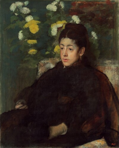 Degas, "Mademoiselle Malot" (1877) — 17.1% luminance The darkest painting in the dataset | 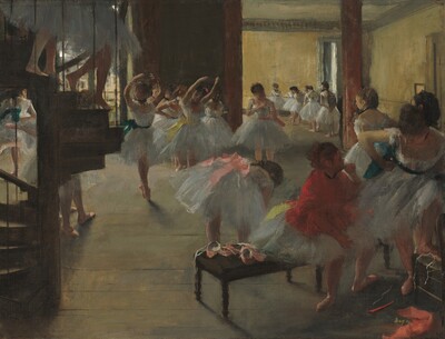 Degas, "The Dance Class" (1868) — 100% warm Gas-lit interior with warm orange tones |
2. Van Gogh's Transformation Is Visible in the Data
Van Gogh's famous evolution from his dark Dutch period to his vibrant French work appears clearly in the color metrics:
| Period | Works | Luminance | Saturation | Temperature |
|---|---|---|---|---|
| Early (≤1886) | 7 | 48.3% | 22.8% | 96% warm |
| Late (≥1888) | 19 | 53.4% | 30.4% | 76% warm |
| Change | +5.1% | +7.6% | -20% |
His late work is brighter, more saturated, and cooler (more blues and greens entering his palette). The saturation increase of nearly 8 percentage points represents the most dramatic vividness shift of any artist in the dataset.
 Van Gogh, "Weeping Woman" (1883) Early period: 40.4% luminance, 9.6% saturation Muted, somber Dutch palette | 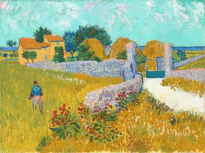 Van Gogh, "Farmhouse in Provence" (1888) Late period: 56.5% luminance, 46.0% saturation Vibrant, sun-drenched French palette |
3. Monet's Palette Shifted Mid-Career, Then Stabilized
Monet's evolution shows a surprising pattern:
| Period | Works | Luminance | Saturation |
|---|---|---|---|
| Early (≤1880) | 27 | 51.5% | 20.2% |
| Middle (1881-1900) | 27 | 54.4% | 14.6% |
| Late (>1900) | 13 | 51.0% | 16.2% |
His middle period was actually his brightest but least saturated—more muted, atmospheric work. His late water lilies returned to earlier luminance levels but retained the softer saturation. This aligns with accounts of his evolving approach to capturing light and his developing cataracts.
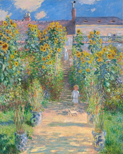 Monet, "The Artist's Garden at Vétheuil" (1881) Middle period: brighter, atmospheric |  Monet, "Water Lilies" (1906) Late period: 0% warm (entirely cool) | 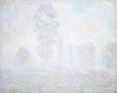 Monet, "Morning Haze" (1888) 87.7% luminance — brightest in dataset |
4. Van Gogh Was the Most Vivid; Monet the Most Muted
Saturation ranking (vividness of colors):
- Van Gogh: 27.1% — the boldest, most intense colors
- Degas: 26.6%
- Cézanne: 26.0%
- Renoir: 24.4%
- Seurat: 24.1%
- Pissarro: 19.8%
- Sisley: 18.6%
- Monet: 17.2% — the most subtle, atmospheric palette
This challenges the common perception of Monet as a colorist—his genius was in luminosity and light, not color saturation.
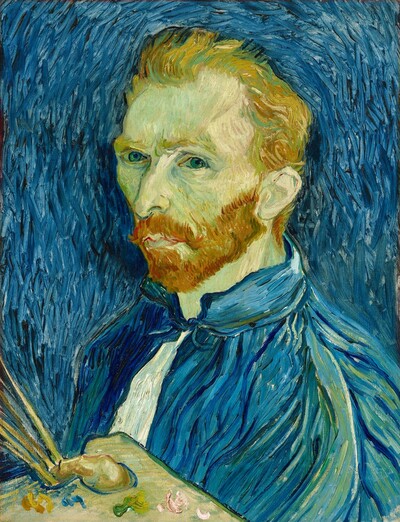 Van Gogh, "Self-Portrait" (1889) 51.0% saturation — intensely vivid | 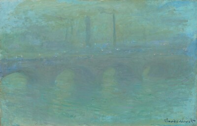 Monet, "Waterloo Bridge, London, at Dusk" (1904) Atmospheric, muted palette typical of Monet |
5. Landscape Painters vs. Figure Painters
A clear divide emerges between artists known for landscapes and those who focused on figures:
Landscape-dominant (brighter, cooler):
- Sisley: 58.2% luminance, 52% warm
- Pissarro: 55.7% luminance, 71% warm
- Monet: 52.5% luminance, 55% warm
Figure-dominant (darker, warmer):
- Degas: 42.0% luminance, 95% warm
- Renoir: 48.0% luminance, 72% warm
The outdoor light of plein air painting appears to produce systematically brighter, cooler palettes.
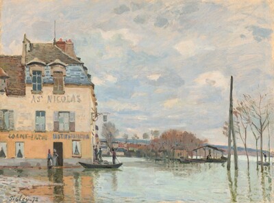 Sisley, "Flood at Port-Marly" (1872) 67.8% luminance — landscape painter's bright palette | 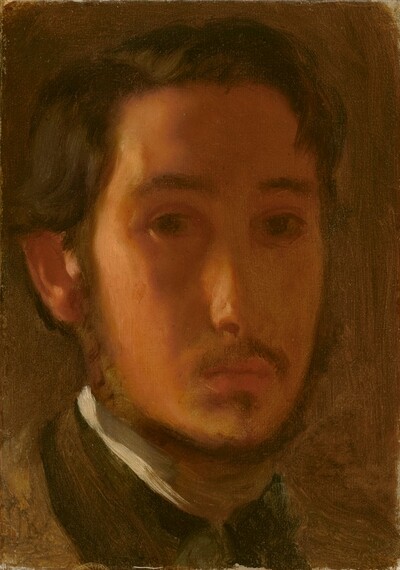 Degas, "Self-Portrait with White Collar" (1857) Figure painter's darker, warmer tones |
6. Seurat's "Scientific" Color Wasn't More Saturated
Despite Pointillism's theoretical goal of creating more vibrant colors through optical mixing, Seurat's saturation (24.1%) is nearly identical to the other Impressionists (23.1% average). However, his luminance is slightly higher (53.6% vs 49.9%), suggesting his technique did produce somewhat brighter results.
 Seurat, "A Sunday on La Grande Jatte" (1884) Pointillist technique: brighter overall but not more saturated than peers |
7. Dominant Hue: Most Impressionists Favor Yellow-Gold
Six of eight artists have dominant hues in the yellow-gold range (45°-81°):
- Degas: 46°
- Seurat: 55°
- Renoir: 76°
- Cézanne: 77°
- Van Gogh: 78°
- Pissarro: 81°
Only Monet (123°) and Sisley (104°) skew toward green—both renowned landscape painters capturing foliage and natural scenes.
8. The 1860s Were Dark; The Movement Got Brighter
Decade-by-decade luminance shows the Impressionist "lightening":
| Decade | Works | Avg Luminance |
|---|---|---|
| 1860s | 34 | 41.8% |
| 1870s | 98 | 49.8% |
| 1880s | 126 | 51.8% |
| 1890s | 58 | 51.5% |
The movement's signature bright palette emerged through the 1870s and 1880s, representing a 10 percentage point increase from the darker 1860s when many artists were still developing their styles.
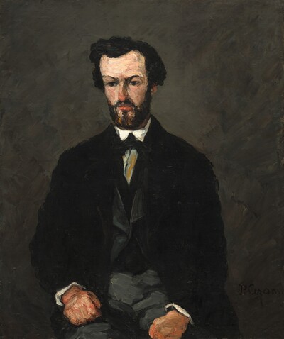 Cézanne, "Antony Valabrègue" (1866) 17.5% luminance — typical dark 1860s work |  Sisley, "The Seine at Port-Marly" (1875) 67.0% luminance — bright 1870s plein air |
Methodology
The color metrics in this project are extracted using k-means clustering (k=5) applied to pixel data sampled from museum collection images via the Art Institute of Chicago, Metropolitan Museum of Art, and National Gallery of Art open-access APIs.
Color analysis was performed by:
- Applying k-means clustering (k=5) to extract dominant colors
- Computing per-pixel metrics:
- Luminance: Mean lightness in HSL color space
- Saturation: Mean saturation in HSL color space
- Hue: Circular mean of hue values
- Color Temperature: Ratio of warm (0°-60°, 300°-360°) to cool (150°-270°) pixels
Data Sources
All museum image data is used under CC0 open-access licenses.
- Art Institute of Chicago API
- Metropolitan Museum of Art API
- National Gallery of Art Open Data (CSV)
Total: 367 paintings spanning 1850-1925
Image Credits
All images are in the public domain and used under CC0 open-access licenses.
| Painting | Artist | Year | Source |
|---|---|---|---|
| Mademoiselle Malot | Edgar Degas | 1877 | National Gallery of Art |
| The Dance Class | Edgar Degas | 1868 | National Gallery of Art |
| Weeping Woman | Vincent van Gogh | 1883 | Art Institute of Chicago |
| Farmhouse in Provence | Vincent van Gogh | 1888 | National Gallery of Art |
| The Artist's Garden at Vétheuil | Claude Monet | 1881 | National Gallery of Art |
| Water Lilies | Claude Monet | 1906 | Art Institute of Chicago |
| Morning Haze | Claude Monet | 1888 | National Gallery of Art |
| Self-Portrait | Vincent van Gogh | 1889 | National Gallery of Art |
| Waterloo Bridge, London, at Dusk | Claude Monet | 1904 | National Gallery of Art |
| Flood at Port-Marly | Alfred Sisley | 1872 | National Gallery of Art |
| Self-Portrait with White Collar | Edgar Degas | 1857 | National Gallery of Art |
| A Sunday on La Grande Jatte | Georges Seurat | 1884 | Art Institute of Chicago |
| Antony Valabrègue | Paul Cézanne | 1866 | National Gallery of Art |
| The Seine at Port-Marly | Alfred Sisley | 1875 | Art Institute of Chicago |